Ammunition
Espresso
My Role
Lead Machine Interface UI/UX
Support mobile App design
Who I worked with
Ammunition UX and UX VP
Ammunition Visual Design
Client Founder and Designer
Engineering contractor
Who They Are

One device on the market.
Start of a marketplace.
Berlin, Bauhaus aesthetic.
Who are we designing for?
From our Strategy team and their CX, we could get an idea for who the typical user is and who to focus on for the future. These were done to prompt discussion with the client and be tested in User Interviews.

Current Interface Problems
By focusing the machine experience on the simple elements, we could provide an app experience ideal for users who wanted to dive deeper.

Competitor study takeaways
Smart subscriptions were very appealing because we had a connected bean hopper with a scale. Though, aligning roaster schedules with receiving fresh beans just as the hopper runs out posed some challenges.

Make tuning your drink easy and hard to mess up
Simplicity above all
Help users understand how to tune each default recipe to their taste, without becoming a barista
Use the app to provide a richer interface/ instruction for drink adjustments
But, tinkering is important, too
How might we..
Breaking up the Use-Cases
By focusing the machine experience on the simple elements, we could provide an app experience ideal for users who wanted to dive deeper.

Where to focus

Laying out the entire wireframe map and necessary interactions, I chose the most heavily-used screens on which to lead the style of the UI.
Early Interaction Explorations


Testing Our Assumptions
Via Facebook Ad, we targeted a range of potential users to get a better understanding of their brewing habits and what they looked for in a machine.

Style Explorations for Home + Brewing Screens

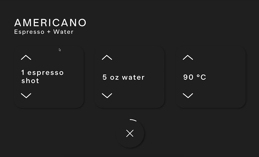
Brewing Adjustment Layout

Scroll Inspiration
The iOS camera has a great approach to laying out adjustment interaction and I explored how it could be applied here. I ended up finding a solution that keeps the scale in line with the parameter, allowing the user to directly swipe from the main screen as shown below.


-
Minimal display of information
-
Simple adjustments as needed
-
Interaction language that can translate throughout the screen designs


Interaction Final
Unifying Language

The iOS camera has a great approach to laying out adjustment interaction and I explored how it could be applied here. I ended up finding a solution that keeps the scale in line with the parameter, allowing the user to directly swipe from the main screen.
Handing off
After working with our visual team to refine buttons and icons, I created the spec to begin being built by the engineering team.

Smart Subscriptions
A connected device offered a lot of potential for using data to make a better experience. Though, I ran into scheduling complications in trying to time when users ran out of beans to when they could automatically receive a new shipment.

Driving to the Marketplace
An 'aha' moment came from specifying espresso parameters for each bean sold on their marketplace and automatically updating the machine settings to match the roast as it arrived at your door. This enabled users to get the best taste out of their machine without having to dive into the settings themselves.
